Colors are a powerful information medium able to support the overall human cognitive system.
Colors enhance the usability of any digital product by guiding the attention of the end-users.
At the same time, they have a cognitive and emotional effect on users’ attitudes or behavior,leveraged mainly in marketing and branding.
Color, shape, size, orientation, and movement can signal that these elements likely share a common meaning or functionality.
Well-chosen colors define the semantics of visual planning and scheduling, too.
They reduce the time needed to understand the message, which leads to greater agility and better-informed decision-making.
There is a ‘but’ however
Too many contrasting colors contribute to disorganization and incoherence.
A large number of colors increases the unpredictability of tasks and the error rate — so reducing the number of colors in the coding of information will also reduce the cognitive burden of the user and help to make the interaction smoother.
Also, keep in mind that some individuals may not be able to distinguish between certain colors (most often blue and red) due to color blindness.
Resco Schedule Board
Current design
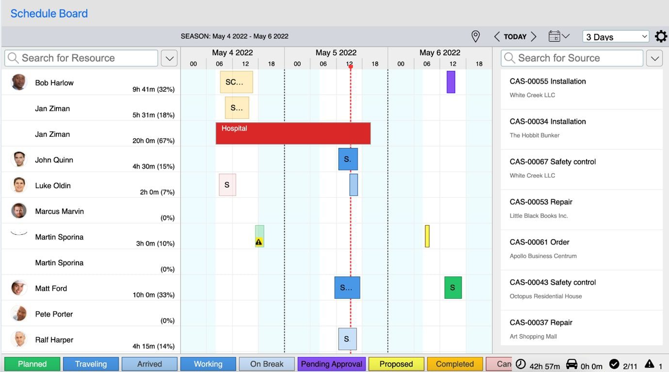
Based on our research on colors, we looked at their use in the component that is the most colored in the Resco application.
It’s a component that gets a slight improvement in usability each quarter.

Schedule Board in the default Field Service project contains a lot of colors, tints & shadows, both the background of the calendar and the tasks in it.
So we’ve done a little research with three participants who do not use the Schedule Board but understand its purpose and the dispatcher’s role.
The research results suggest that several colors’ meanings are challenging to deduce. The most significant problems included:
- the recognition between green and blue tasks (both were perceived as “OK”),
- the recognition between various tints of blue tasks (“maybe the light blue tasks have already been done, while the dark blue ones are still in progress”),
- incorrect guessing of the meaning of sharp yellow and dark yellow,
- purple color which didn’t carry any obvious meaning (“something leisure”, “maybe some administrative work”),
- sharp red color which attracted too much attention and was perceived as related to the pink color.
New design
Based on this research and analysis of other similar calendar tools, we propose a color change in the Schedule Board in the default projects to enhance the experience of users.
When the box in the calendar is wide enough, we will also display an icon that can help users better understand the meaning of the color.
We also want to inspire you to think about their meaning when defining your own colors, not to define too many of them, and to always think of the users for whom they should be a visual aid and not a cipher that they have to crack with a legend.

It is not important that Planned tasks are marked in a strong color — green, as in the current state.
These tasks are fine, all necessary steps have been taken by the dispatcher, they only need to be completed, so we painted them gray. We left the green color to the Completed tasks — it is the most ideal state that can be achieved, employees should be rewarded for them, and their results should be evaluated (e.g., reports from inspections or the result of a sales appointment).
Time-Offs, currently sharp red, should not attract so much attention. It is only a message to the dispatcher that an employee will not be available, but he does not have to do anything about it, so we painted them gray, and we added a stripe pattern to them to further reduce their priority over planned tasks.
Particular attention should be paid to tasks that require the intervention of a dispatcher:
- Canceled tasks for which the dispatcher should find out what problem has occurred — pink,
- Pending Approval tasks, which require the dispatcher’s confirmation of the newly proposed time — yellow,
- Proposed tasks have to be confirmed well in advance by the contractor and the dispatcher must pay attention to this — yellow with stripe pattern (which indicates waiting).
Finally, we marked all tasks that are In Progress in blue. We have added the stripe pattern to those statuses that mean that the worker isn’t currently performing his primary work activity, but is either ‘Traveling’ to the customer or is ‘On break’.
Other In progress tasks can have a solid color, as the worker has either Arrived and is preparing tools or talking to the customer or is Working hard.
Originally, we were also thinking about color differentiation: darker and lighter shades of blue distinguishing statuses even more, so there is no need to rely on the icon.

However, there would be too many visual elements distinguishing the statuses of In Progress tasks, so we decided to stick to the stripe pattern and icons.
Of course, our new design needed user testing, too. We again showed the Schedule Board filled with tasks of all statuses to three participants, other than during the first testing.
We first asked them to interpret the colors themselves, and then provided them with a list of all the statuses to assign to the colors. Findings are the following:
- The visual similarity between the Planned tasks and the Time-off slots seemed strange to the participants.
- The red tasks with an exclamation mark – Violations – indicated an overdue or a high priority to two participants.
- The pink tasks with a cross – Canceled – were also perceived as a conflict in the past or as declined by contractors.
- There was a problem with the yellow tasks. Participants were not able to find a semantic symbol in yellow color initially.Later, the clock icon and the stripe pattern helped them to understand that the Proposed tasks mean that the dispatcher must wait for the contractor’s response.
However, the exclamation mark caused the Pending Approval tasks’ design to indicate less severe violations or a priority slightly lower than the red tasks.
Although the real meaning is a little different, our original goal – to direct the dispatcher’s attention to Violations and Pending approval tasks via colors and icons – has been accomplished.
On mouse over, a dialog with a verbal expression of the status is displayed above each task.
- Without help – the list of all statuses – it was sometimes quite difficult for the participants to deduce the meaning of individual types of blue tasks.
In the second part of the testing, i.e., when the participants had a tool in the form of a list of all statuses, the success rate was satisfactory: 85 %. The icon turned out to be an important aid in interpreting meaning. We have decided to additionally mark the Canceled tasks by striking out the task name. To prevent semantic grouping of Planned tasks and Time-off slots due to the same color, we have replaced the gray color of scheduled tasks with white.
Final words
As you can see, color is a really strong carrier of information. In visual planning, the benefits of colors are even greater than elsewhere in UI design, and the user sometimes can’t even imagine planning without their support.
Thanks to the usability testing of the current and new colors in the Schedule Board, we were able to assess well the meanings of which colors are understandable even without a legend, which require longer thinking, and which we must necessarily change because they evoke a completely incorrect or no semantic association.
In this way, you can think about the colors in several places in the application, e.g. in the Style editor, with which we can support visual hierarchy of certain data to promote their noticing or understanding in views and forms.

![Forms on Microsoft Power Platform [5 key takeaways from the latest whitepaper]](https://www.resco.net/app/uploads/forms-on-power-platform-hero-blog-416x243.jpg)
