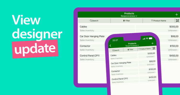
In the upcoming release, we’re making a significant change to how cells resize within a row.
This change should not affect the old way of responsiveness, and all settings should be handled seamlessly. However, we would like to verify with you whether all your important projects will correctly represent the design in the mobile application.
It would be great if you could try out all the important customizations in the latest preview version of the mobile application.
Why the change?
Users sometimes experienced overlaps of cells in rows, making the content unreadable due to misconfigured anchoring. The anchoring tool was quite complicated, with some options having zero effect on the final layout, contributing to the confusion.
How we’re fixing it
Newly added cells are now set to responsive by default. This means that as the row width increases, the cells will proportionally increase as well, maintaining gaps between individual cells, but also distances from the row edges.

In the case of inserting images, such as avatars in contacts, you do not want them to be responsive, as they have a static size. In such a case, it is necessary to turn off the responsiveness and set the anchoring either on the right or left side. The new algorithm for cell responsiveness within the row will take care of everything else.

What you’ll see
In the design editor, when selecting a row, you will see not only cell boundaries but also an arrow either to the right or left according to the activated anchoring in the properties pane.

How does responsiveness work?
If responsiveness is set to “On,” a cell will stretch as the screen expands to avoid leaving empty space. If it is the only element in a row, it maintains consistent margins from its parent row, behaving as though its right and left sides are anchored to the edges.
If two responsive cells are adjacent, they keep a distance from both sides.
However, if an overlap occurs that wasn’t originally designed, it gets corrected according to the template pattern, preserving the proportion of widths and their mutual indentation.


Responsive is set to “Off”
When responsiveness is disabled, the cell will have a fixed width and will be anchored on the selected side. Consequently, when the width changes, the cell will maintain its fixed width and distance from the marked side of the row.
Tips for designing
Make sure your row width fits the smallest screen you’re designing for. This helps avoid overlaps and makes scaling smoother.
This means that if you want to use a view as part of a tree view, you must take into account the width of the row in this component. Otherwise, overlaps may occur.
Scaling works best from the proposed width upwards.
Font size matters
In the latest version, font sizes now look the same on the canvas as they do on devices. So you’ll see exactly how your text will look. We recommend setting cell height a bit bigger than the font size to avoid cutting off text.
Starting from version 17.1, the font size has been standardized to match the actual size on devices. As a result, the canvas preview will reflect the true appearance. This allows you to see, for instance, if text is getting cut off due to insufficient cell height. We recommend setting the cell height to about 15 to 20% greater than the font size. For example, for a font size of 15 dp, the minimum cell height should be 17 dp.
Give it a try
Before the official release in the end of May, we’d love for you to test out these changes in the preview version. Try your important customizations and let us know what you think!
Let us know if you have any questions or feedback.


